![]() Felicia Gorgacheva:
Felicia Gorgacheva:
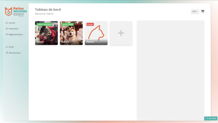
Hello, I have my navigation placed vertically on the left side of my screen on browser. How could I make it pop out from the left on mobile/smaller screens when a menu button is pressed?
![]() Hassan Mukhtar:
Hassan Mukhtar:
Hey Felicia, how is your menu made, is it an HTML slot or from the navigation tab
![]() Felicia Gorgacheva:
Felicia Gorgacheva:
Here’s what it looks like and this is all from the Menu Schema in the Navigation tab and custom CSS.
![]() Hassan Mukhtar:
Hassan Mukhtar:
Would something like what this template does be applicable? https://templateclientportal2.fmbetterforms.com/#/
![]() Felicia Gorgacheva:
Felicia Gorgacheva:
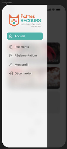
It’s almost what i’m looking for; I need the navigation to appear from the left when the button is pressed on mobile but instead of moving the content, appear on top like this ideally
![]() Hassan Mukhtar:
Hassan Mukhtar:
The best method would bbe then creating a formheader slot and have it open
![]() Felicia Gorgacheva:
Felicia Gorgacheva:
I’m sorry, I’m not sure I know how to do that ![]()
![]() Hassan Mukhtar:
Hassan Mukhtar:
No worries, just getting you an example
![]() Andrew Dam:
Andrew Dam:
Hi Felicia! I’ve built out a quick example on how you can create a sidebar that is only visible on mobile screens.
Here is the HTML that would go into your “FormHeader” slot in your app:
<!--mobile nav bar -->
    <div class='w-full  h-full lg:hidden'>
        <div class="relative"></div>
        <div class="flex p-4 bg-slate-700 bg-opacity-50 justify-between  items-center">

            <!--mobile menu -->
            <div>
                <div @click="app.showMobileMenu = !app.showMobileMenu" class="cursor-pointer">
                    <i class="fa-solid fa-bars text-xl text-white"></i>
                </div>

                <!-- Outside the drop down clickable to close -->
                <button v-if="app.showMobileMenu" @click="app.showMobileMenu=false" class=" fixed top-0 bottom-0 left-0 z-10 w-full h-full left-0 bg-black opacity-50 cursor-default lg:hidden"></button>

                <!-- mobile menu side bar -->

                <div class="flex justify-between">
                    <transition enter-active-class="transition ease-out duration-100" enter-class="transform opacity-0 scale-95" enter-to-class="transform opacity-100 scale-100" leave-active-class="transition ease-in duration-75" leave-class="transform opacity-100 scale-100" leave-to-class="transform opacity-0 scale-95">
                        <div v-show="app.showMobileMenu" class="origin-top-left absolute top-0 left-0 shadow-xl min-w-[323px] w-[323px] z-50">

                            <div class="rounded-md bg-slate-700 text-white">
                                <div class="h-screen overflow-auto no-scrollbar text-sm" role="menu">

                                    <!-- close -->
                                    <div @click="app.showMobileMenu=false" class="px-3 py-4 cursor-pointer"><i class="fa-solid fa-xmark text-xl"></i></div>

                                    <!--menu links-->
                                    <div>

                                        <div @click=" app.activeNav = 'Home'; app.showMobileMenu = false; vueapp.$router.push('/home')" class="flex flex-col items-center justify-between px-3 py-4  cursor-pointer" :class="app.activeNav==='Home' ? 'border-l-4 border-sky-500':'border-l-4 border-transparent'">
                                            <div class="flex items-center w-full justify-between">

                                                <div class="text-base font-normal">Home</div>
                                            </div>


                                        </div>


                                    </div>

                                </div>
                            </div>
                        </div>

                    </transition>
                </div>


            </div>


        </div>
    </div>
It is important to note that you will need a default key in your App model of showMobileMenu which can be set to false by default.

