As part of my ongoing app design I wanted a way of triggering a notification to the user from within a function snippet without having to create a namedAction which contained the alert or modal snippet and then call this using BF.namedAction (‘notificationNamedAction’, {})
After a bit of Google I came across Sweet Alert 2 which I’ve used across my app. For me Sweet Alert 2 sits nicely between the BF Alert and BF Modal Dialogues so thought I’d share some of the uses and bits of code I’ve written. Images below don’t capture the animation but you can see this on the examples on the Sweet Alert website
Installation
Add the CDN to your BF DOM Header Insertions in the Load Later section
<script src="//cdn.jsdelivr.net/npm/sweetalert2@11"></script>
Simple Notifications
In its simplest use this is now my go to way of notifying users about errors, warnings, information etc. I’ve used it linked to an info icon for help popovers and throughout my app for informing the user of missing info etc based on a JS if statement.
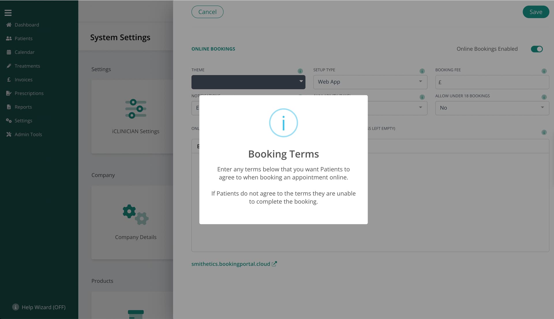
Here’s an example of the code required within the JS snippet:
Swal.fire({
        title: 'User Details'
        html: '<div class="text-center my-8">Please enter new user\'s First Name</div>',
        icon: 'warning',
        showCloseButton: false,
        showConfirmButton: false,
        timer: 4000,
});
More Complex Tasks
Sweet Alert 2 support the inclusion of buttons and input fields too so I’ve also used it to allow user input for things like my record delete protection feature:
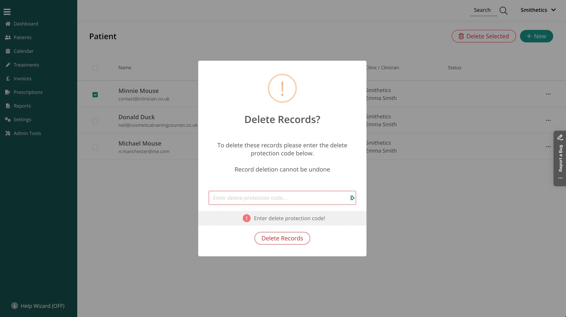
Code for this:
Swal.fire({
        title: 'Delete Record?',
        icon: "warning",
        html: '<div class="text-center my-8">To delete this record please enter the delete protection code below.<br><br>Record deletion cannot be undone</div>',
        input: 'password',
        inputPlaceholder: 'Enter delete protection code...',
        showCloseButton: false, //default is 'true'
        focusConfirm: false, //Set to false if you want to focus the first element in tab order instead of "Confirm"-button by default.
        confirmButtonText: 'Delete Record', //Default is 'OK'
        buttonsStyling: false, //Apply default styling to buttons. If you want to use your own classes (e.g. Bootstrap classes) set this parameter to false.
        customClass: {
            confirmButton: 'btnDelete mb-4',
        },
        preConfirm: (deleteCode) => {
            if (!deleteCode) {
                Swal.showValidationMessage(
                    'Enter delete protection code!'
                )
            }
        },
        allowOutsideClick: () => !Swal.isLoading()
    }).then(deleteCode => {
        const deleteRecordProtectionCode = app.activeOrganisation.deleteRecordProtectionCode;

        //If the deleteCode entered is the delete code
        if (deleteCode.value == deleteRecordProtectionCode) {

            bf.namedAction("deleteProtectionCodeCorrect");

        } else {

            Swal.fire({
                title: "Incorrect Code!",
                icon: "error",
                html: '<div class="text-center my-8">Record cannot be deleted</div>',
                showCloseButton: false,
                showConfirmButton: false,
                timer: 3000,
            });

        }
    });
Custom Function
To allow me to easily call a Sweet Alert notification from within FileMaker I also wrote a simple CF
BF_SetAction_SweetAlert ( title ; html ; icon ; timer )
/*********************
* BetterForms Custom Function
* PURPOSE: Adds a 'function action to $$BF_Actions
* RETURNS: $$BF_Actions
*
**********************/

Let([

/* enable for debugging
$$BF_Actions = "[]";
actionName ="path";
optionsObj="{}";
 */

       // handle $actions not being set
       $$BF_Actions = If ($$BF_Actions = "" ; "[]" ; $$BF_Actions);

       function = "Swal.fire({title:'" & title & "',html:'" & html & "',icon:'" & icon & "',timer:" & timer & ",showCloseButton: false,showConfirmButton: false,});" ;

       actionObj = JSONSetElement ( "" ;
               [ "action" ; "function" ; JSONString ];
               [ "function" ; function ; JSONString ]
               );
       index = ValueCount ( JSONListKeys ( $$BF_Actions  ; "" ) );
       actions = JSONSetElement ( $$BF_Actions ; "[" & index & "]" ; actionObj ; JSONObject )

];

actions

)
Final chunk of code is something that I’ve put togther that include tha majority of the myriad configuration options available with Sweet Alert
Swal.fire({
    //THERE ARE A FEW MORE OPTIONS ON THE SWEET ALERT 2 WEBSITE
    title: '<strong>HTML <u>example</u></strong>',
    //titleText: '', //Use either title or titletext
    icon: '', //warning, error, success, info, question
    text: '', //is overridden by html if both are included
    html: 'You can use <b>bold text</b>, ' +
        '<a href="//sweetalert2.github.io">links</a> ' +
        'and other HTML tags',
    //input: '', //can be text, email, password, number, tel, range, textarea, select, radio, checkbox, file and url
    //inputLabel: '',
    //inputPlaceholder: '',
    //inputValue: '',
    //inputOptions: {}, //If input parameter is set to "select" or "radio", you can provide options.
    //width: '', //Popup window width, including paddings (box-sizing: border-box). Can be in any CSS unit (px, em/rem, %).
    //padding: '', //Popup window padding. Can be in any CSS unit (px, em/rem, %).
    //color: '', //Color for title, content and footer (CSS color property). The default color is '#545454'
    //background: '', //	Popup window background (CSS background property). The default background is '#fff'
    //position: 'top-end', //Can be 'top', 'top-start', 'top-end', 'center', 'center-start', 'center-end', 'bottom', 'bottom-start', or 'bottom-end'
    //timer: 4000,
    //allowOutsideClick: false, //default is 'true'
    //allowEscapeKey: false, //default is 'true'
    //allowEnterKey: false, //default is 'true'
    //showConfirmButton: false, //default is 'true'
    showCloseButton: false, //default is 'true'
    //showDenyButton: true, //default is 'false'
    showCancelButton: true, //default is 'false'
    focusConfirm: false, //Set to false if you want to focus the first element in tab order instead of "Confirm"-button by default.
    //focusDeny: true, //Set to true if you want to focus the "Deny"-button by default.
    //focusCancel: true, //Set to true if you want to focus the "Cancel"-button by default.
    confirmButtonText: '<i class="fa fa-thumbs-up"></i> Great!', //Default is 'OK'
    confirmButtonAriaLabel: 'Thumbs up, great!',
    cancelButtonText: '<i class="fa fa-thumbs-down"></i>', //Default is 'Cancel'
    cancelButtonAriaLabel: 'Thumbs down',
    denyButtonText: '<i class="fa fa-thumbs-down"></i>', //Default is 'No'
    denyButtonAriaLabel: 'Thumbs down',
    buttonsStyling: false, //Apply default styling to buttons. If you want to use your own classes (e.g. Bootstrap classes) set this parameter to false.
    customClass: {
        //container: '...',
        //popup: '...',
        //header: '...',
        //title: '...',
        //closeButton: '...',
        //icon: '...',
        //image: '...',
        //htmlContainer: '...',
        //input: '...',
        //inputLabel: '...',
        //validationMessage: '...',
        actions: '!w-full !px-4 flex !justify-between', //This moves the buttons to the edge with some padding. Remove this to centralise the buttons
        confirmButton: 'btnPrimary',
        //denyButton: '...',
        cancelButton: 'btnSecondary',
        //loader: '...',
        //footer: '....',
        //timerProgressBar: '....',
    },
    reverseButtons: true, //Set to true if you want to invert default buttons positions ("Confirm"-button on the right side).
    //returnFocus: false, //Set to false if you don't want to return the focus to the element that invoked the modal after the modal is closed.
    //imageUrl: '', //Add a customized icon for the popup. Should contain a string with the path or URL to the image
    //imageWidth: '', //If imageUrl is set, you can specify imageWidth to describes image width. Can be in any CSS unit (px, em/rem, %).
    //imageHeight: '', //If imageUrl is set, you can specify imageHeight to describes image height. Can be in any CSS unit (px, em/rem, %).
    footer: ''
})
Certainly doesn’t replace either the alert or modal snippets already included in BF but with a single CDN and a couple of lines of code I think this is a great addition and gives lots of flexibility for trigger notifications from within a function snippet, from within FileMaker and even as part of an @click button call if needed