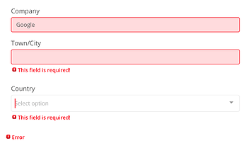
Having a couple of issues with invalid UI, fields appear red even if valid so long as there is a single invalid field in the panel.
The Error tag at the bottom of the panel is really irritating as I have multiple nested panels and every one shows an error tag if something is invalid, so for a single missed field the user get ‘This field is required!’ and 2 lots of ‘Error’ which is messy, especially when these tags cause everything to budge up.
Regarding the field style when it’s valid:
Have you enabled the “Validate After Changed” option on the form’s Integration tab? If not, the style won’t change until you run the validate action again. That’s my understanding at least.
Regarding the panel’s error:
I’ve been bothered by that as well. I’m no CSS wizard, but it looks like you can hide that element via:
.field-panel > div.help-block.errors {
  display: none;
}
Thanks for the css suggestion, I will give it a test. I don’t have validate on changed on but the fields would behave like this after clicking a button which runs a validate action.
